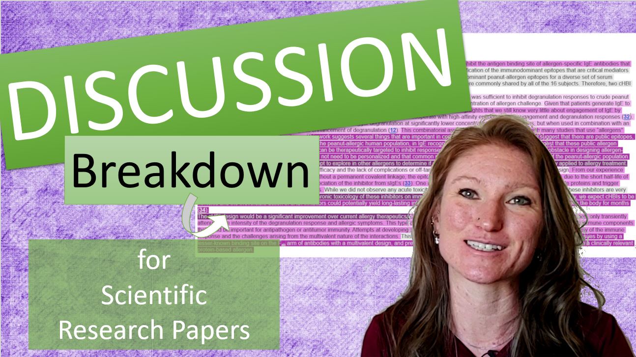
Since every one is home now and (trying to be) writing, I’ve started getting requests for breakdowns of different sections of scientific research papers like I present in my workshops.
Because the discussion section is one of the trickier ones, that’s where we are starting!
So without further ado…here is your breakdown of a discussion section of a scientific research paper.
The History of my Manuscript Breakdowns
One of the major things I wanted to do at ButlerSciComm was develop formulas scientists could use to write their manuscripts faster and with less stress.
I developed the formulas I now teach by reading tons of manuscripts across disciplines and from the top journals, determining what “key parts” were in each section, and then highlighting these key parts by section to visualize where the different pieces of information were typically located.
I did this for papers that I considered to be “good”, “readable”, and “understandable” and compared those highlighted paper sections to those from papers that were “dense”, “difficult to interpret”, or well, “boring.”
I have folders of Word documents and collated Powerpoint presentations that look like this:
Doing this allowed me to see what the “good” manuscripts were doing right and where less good manuscripts were falling short…and better yet, what they could do to improve.
Then, when I went to teach these sections in my workshops, it was easy to see how continuing to use color-coding breakdowns of manuscripts was the easiest way for everyone to visualize exactly how I developed my formulas.
So I took these highlights and formulas for the different sections and developed systems to teach this.
I hope they help you! 🙂
In case videos are more your speed than text…
We’ve got you covered here, too. 😉
So, how will the breakdowns work?
Each major section of a paper will (eventually) be broken down on my blog, and each will have its own color scheme for the highlighting.
The highlighting will use shades of the same color, with the darkest shade corresponding to the part with the broadest scope, and the lightest shade corresponding to the narrowest scope. For more on what I mean by scope, please see this post.
Then, I will show breakdowns of what I consider to be ideal sections and indicate the key points.
Finally, because I dislike showing “bad examples” of other people’s work (hey, we all tried), I am rewriting the great examples to reflect the common mistakes.
Ready to go?
Awesome.
The 6 key points you need to include in a discussion
Several months ago I shared a post including the 6 key points you need to have in your discussion (read it again here), and the discussion will be the first breakdown section we do together.
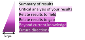
To recap, the 6 key points are:
1. Summary of results
- Reminds the reader of key results of your work
2. Critical analysis of your results
- Interprets the significance of your results for the reader
- Includes highlighting all trends, relationships and new knowledge
3. Relate results to field
- Shows how your results fit into the field as a whole
- This is where you relate to previous work and include references
4. Relate results to gap
- Shows how your results relate to the gap in the field, i.e., edge of current knowledge
5. Beyond current knowledge
- Speculation about how the field has changed or new hypotheses that can be made
6. Future directions
- Future studies that can address new hypotheses or limitations to your current study
Color coding the sections
As written, these key parts are already in order from the narrowest scope (the closest to your research) to the widest scope.
Therefore, we can apply the color scheme, shades of purple for a discussion, directly to this list:
As a recap and to help you again visualize how the different parts are integrated, here is an illustration, with each part colored to match the 6 key parts above:
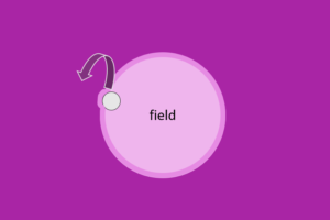
Here, you can see that the little gray spot of your research is only a small part of the field as a whole, so it is good to orient the reader as to where in the field your work fits.
Then, your work should address the edge of that field somehow, which is the gap in the field you sought to address, and it might even push this gap out a bit further!
Next, there is a whole lot going on outside of what is known in your field that remains to be discovered and should be speculated on, and the reader should be provided with a path for how you might get from where you are now to that great expanse beyond.
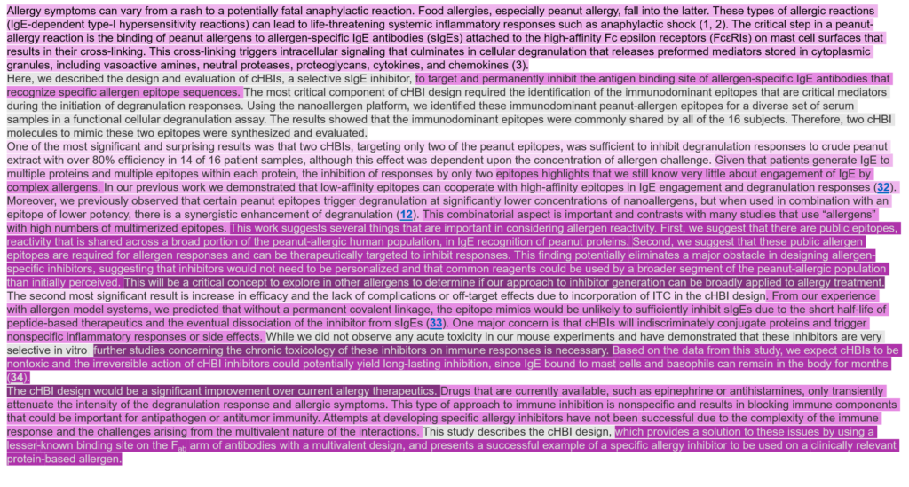
The IDEAL discussion section
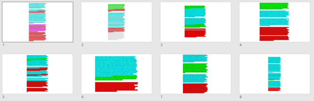
I found my ideal discussion section in PNAS –> Deak et al., PNAS (2019), 116 (18) 8966-8974; DOI:10.1073/pnas.1820417116.
The entire article is VERY well written, and you can check it out (here) to read about designer inhibitors for preventing the IgE response in peanut allergies.
Initial breakdown:
Now, using the discussion from this paper, I am going to walk you through how an ideal discussion is arranged, using the color coding for the different key parts of a discussion as I have outlined above.
I have colored it according to my interpretation of the 6 key parts – if yours is slightly different, no worries – there is overlap in these different parts. The general trend should be the same, though!
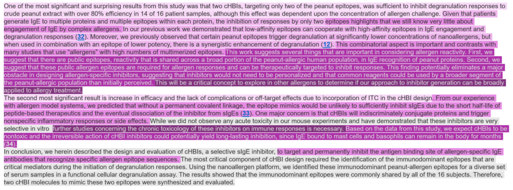
Color coding the discussion section according to the colors above gives this nice diagram. What do you see right away?
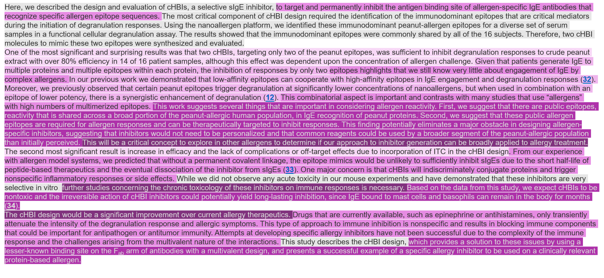
- Notice that there is a definite trend to the way the colors are distributed in this discussion section.
- In fact, the colors on the whole trend from the lightest concentrated at the top to the darkest concentrated at the bottom:
- This lines up nicely with what we know of the scope of the discussion – it should move the reader from the narrowest scope that is the body of your paper and the research that you did to the widest scope, which relates this work to the field as a whole.
This discussion does a fantastic job of doing exactly that!
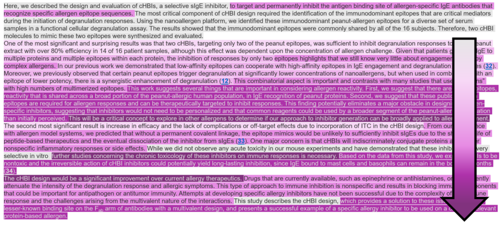
- The next thing that you might notice is that there are 4 paragraphs, and there are some distinct groupings between the colors present in the different paragraphs:
- I have marked here the three different types of paragraph you’ll find in a discussion:
- Blue (first): mostly grey (recap of results) and some of color #4 (the GAP in the field)
- Green (middle paragraphs): contain all colors, trend from lightest to darkest within paragraphs
- Orange (last): mostly last 3 colors (widest scope)
Types of paragraphs:
- The first paragraph, in the blue bracket, I term the introduction to the discussion.
This paragraph summarizes the key results of the paper (gray color) and relates them directly to the gap in the field that you sought to address with this paper.
This paragraph is often used as the final and concluding paragraph (mistakenly, see here!), but it has a bigger impact at the beginning of the discussion.
Why? Think of the scope again! At the beginning of your discussion, your reader has your results on the brain – start drawing them into the rest of the discussion by summarizing the key points and relating them to the gap in the field.
This serves to highlight the importance of your entire paper, as well, by giving a quick recap placed into a bigger context.
- The second and third paragraphs, in green brackets, are the meat of the discussion.
These paragraphs take a key result and relate it back out to the field and then beyond the field by relating it to as many of the parts of a discussion (as many colors) as possible.
That is why these paragraphs also trend lightest to darkest -> They start at the work and an analysis of it, and then expand on it…this naturally moves from the lightest colors to the darkest.
A key note here – these paragraphs start at lighter colors because you discussion BUILDS on your research. A great way to keep your discussion on the right track is to follow this pattern and color order – always build on your research and you won’t get stuck in the trap of including chunks of introduction or unrelated discussion.
- The last paragraph, in the orange bracket, is the conclusion.
If you remember from the post on conclusions (here), this entire paragraph should be forward thinking, showing the reader a bigger picture of what is possible with your work.
Because of that, it is natural that this paragraph would be the darkest 3 colors in your discussion – it should definitely have the broadest scope!
- Another point to notice is the amount of gray color in the discussion – it is located almost entirely in the first paragraph and then in only small chunks thereafter:
- In this highlighted sentence, we can see that it begins with some recap of results, but it does not even form a full sentence. This use of a recap as a “bridge” is perfect – it tells the reader only exactly what they need to remember for the next point to make sense, but doesn’t go into any details. Great!
Common problems in the discussion section
After the example of the ideal discussion, I am going to show examples of the most common problems I see in a discussion and indicate how you might recognize them if they happen to you.
I am using the same example paper as above, but I have falsely edited the discussion to reflect the common problems that I see when editing. The authors have written an excellent paper, and are in no way responsible for the damage I am inflicting on their discussion here. 🙂
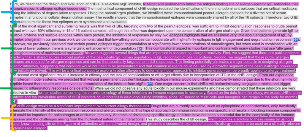
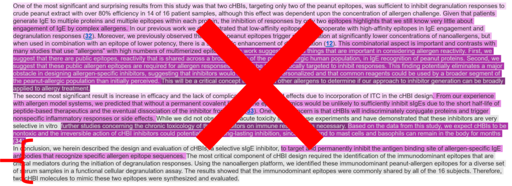
Problem 1
Can you spot the problem here? Feel free to compare it to the previous discussion (and scroll down for the answer):
.
.
.
.
.
.
.
.
.
.
- In this discussion, there is a large block of text colored as the “field” at the beginning of the discussion. DON’T DO THIS!
It is not uncommon to see a large chunk giving background information on the field right at the beginning of the discussion, though this should either be in the introduction (where I copied this chunk from!) or should be split up inside of your discussion.
In the discussion, you don’t need background info anymore – all of this should be in the introduction.
The only reason you should be introducing information from the field in the discussion is because it related to your results – so these chunks of color should be broken up and dispersed, and should come AFTER lighter colors #1 or #2, which recap and analyze your results).
Remember – you want to BUILD from your results here…think of the upside-down pyramid in the scope diagram – everything stems from your results.
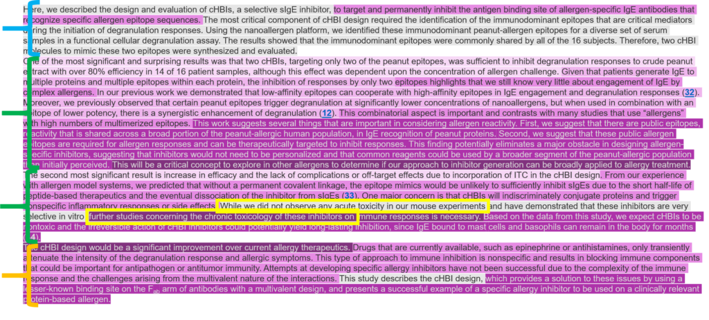
Problem #2
Can you spot the problem here?
.
.
.
.
.
.
.
.
.
.
- Here is another common problem I see – that recap paragraph is at the end, and serves as the conclusion.
I know I didn’t write the smoothest text here for my examples, but try reading this to see how it breaks up your flow and thought process as you read through the discussion.
In the paragraphs about the results, you should be starting to make connections and seeing how everything fits together…and then suddenly you are thrown back into the narrowest scope for a recap of your results.
Then think instead about how the original conclusion changes this – it is all forward thinking and relates the results of the paper to the now-existing possibilities, which makes for a much more exciting conclusion.
A forward-thinking conclusion also does a great job of highlighting the importance of your work in the field, something that a summary conclusion does not do at all.
Problem #3
Can you spot the problem here?
.
.
.
.
.
.
.
.
.
.
- This is a bit of a subtler problem, though the most common I see in discussions – there is a lot of recapping and analyzing the results, but most of the text that was in darker colors is missing.
This happens when the writer is great at analyzing their own results, but doesn’t do a great job of integrating those back in the field.
Try reading over this discussion now, especially in comparison to the good example to see if you can tell what is missing and see how it can easily prevent the reader from integrating your work into the field, and therefore can allow them to miss the importance of what you did.
Help them see not only what you did, but also how it fits into the field, how it changes things, and what it means for the future of your field and science as a whole.
Your turn!
Working on a discussion section and want to see how it shapes up? You can do this same exercise, especially when you are just getting a feel for the flow of a discussion.
If you want to do the exact same thing and use a cascading scale of colors, try this tip:
So if you want to have a range of colors to choose from, look for the fill button and not the highlight button!
So how is it?
- Do you see any of the same problems I pointed out before?
- Are you missing any colors?
- Do you have too much of any one color?
- Would doing any rearranging help improve the flow or impact of your paper?
What do you think?
Did this breakdown of discussions help you?
What major thing did you learn?
What do you want to see next?
Thank you very much for this page (and video). I got a bit stuck with the discussion in one part of my doctoral thesis and this got me on the road again.
Super glad to hear it, and thanks a lot for the feedback!